Your read progress
Smart Money People - still us, just a bit smarter!
4 minute read
Updated 17th September 2025 | Published 20th March 2023

We’ve had a makeover. As the go-to resource for financial services reviews, we decided it was time to make ourselves more visually appealing and memorable. A bit ‘smarter’ if you will.
Our previous branding hadn’t evolved much since our launch back in 2014. We felt it didn’t reflect the influential, insightful and rapidly growing platform and business we’ve built. And it didn’t show our passion for financial services.
But our new look is more than just a lick of paint. With so much choice and complexity in the world of finance, now more than ever, people and businesses need reliable, trustworthy and timely information when making decisions with their money. That’s why we've got lots more exciting plans for this year to make Smart Money People offer an even better experience, which we can't wait to share with you soon.
First, a little more about our refresh...
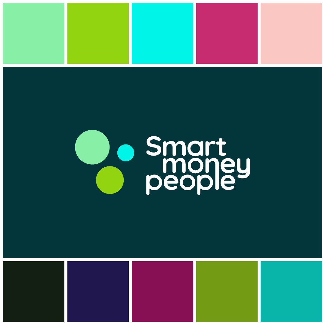
Colour palette
We believe financial services is anything but boring. Too often, however, financial services branding is dreary, dull and uninspiring.
Our new colour palette and logo have been designed to counter this. We’ve chosen a range of modern greens that bring positivity, and they’re supported with vibrant accents in hot pinks, clean teals and deep blues, to ensure an impactful look and feel.
Our eye catching and vibrant look will attract more users, engage with more people about their money and achieve our goal of helping shape better decisions in financial services.
Our smart new logo
We’ve chosen a simple, much streamlined, yet striking motif that better reflects our aim of offering clarity in a complex world. The three circles represent the many reviews that make up our powerful insights. By linking the n of money to the l of people in our wordmark, we’re celebrating how those insights connect money and people. Simple but smart!
Our typeface
It’s also important to us to show the friendly and human side of our business. After all, we’d be nothing without the real people who leave their genuine reviews on our site. So we’ve chosen Quicksand as our typeface. Its straightforward, rounded form reflects our insightful yet down-to-earth approach and also that of our reviewers. It also offers strong design possibilities in both print and digital.
Tone of voice
Financial services is full of unhelpful jargon but we’ve always strived to communicate clearly. As part of our refresh, we’ve had a long hard think about how we can be even more plain speaking. Our words will be no less useful but we will be even more direct, more user-friendly and more inclusive.

Collective wisdom
Smart Money People is where people like you can go to read genuine reviews and get insight into products and services that help companies and consumers make better decisions.
We’ve now collected more than 1.2m reviews. These insights, comments and experiences from real people are the power behind our platform. As part of our new identity, we wanted to visually represent how the collective wisdom of the many individual reviews amounts to a larger, dynamic force, shaping the future of financial services.
We’ve called this our ‘smart cloud’.
Like a murmuration of starlings, our smart cloud is made up of many individual spheres – signifying our community of reviewers – that work together to inform better decisions for consumers and businesses.
In future, these smart clouds will be a distinctive thread running through our communications. They can be shaped to represent the emotional benefits of Smart Money People – reassurance, support, guidance and empowerment. For example, they may appear as a path leading through complexity, as steps helping someone improve their finances, or as a protective ‘bubble’ surrounding a family.
.png)
Giving our awards a polish
The eagle-eyed may have also noticed that our awards are now part and parcel of our main website. We’re really proud of our awards and how they have become a cornerstone of our industry. This more integrated approach better recognises the awards as part of the greater Smart Money People family.
Celebrating the very best companies in UK banking, consumer credit and insurance, the three awards have been given their own distinct colour scheme but they’ll adopt the same stylistic principles of our main brand. Their new branding will be a smart addition to every winner’s and finalists’ website and adverts and we can’t wait to see them being used.
What’s next?
We’re not resting on our laurels, that’s for sure.
With our new brand now live, we’ve got a real spring in our step and we’re looking forward to revealing lots more exciting developments later in the year.
We’ll keep putting the ‘smart’ back into money.

Written by Emma
Head of Marketing
Emma joined us in 2021. She is passionate about ensuring others make good choices with their money using all the information and data available.
As Featured By
Join our mission
We use the power of consumer reviews to help increase trust and transparency in financial services and to deliver industry leading insight and events.
Write a reviewRelated smart money people news articles
View smart money people news
.png)
What you need to know about the UK interest rate announcement (June 2024)
17th September 2025 by Errolyn.jpg)
Just how linked are money and mental wellbeing?
15th September 2025 by Emma (2).png)